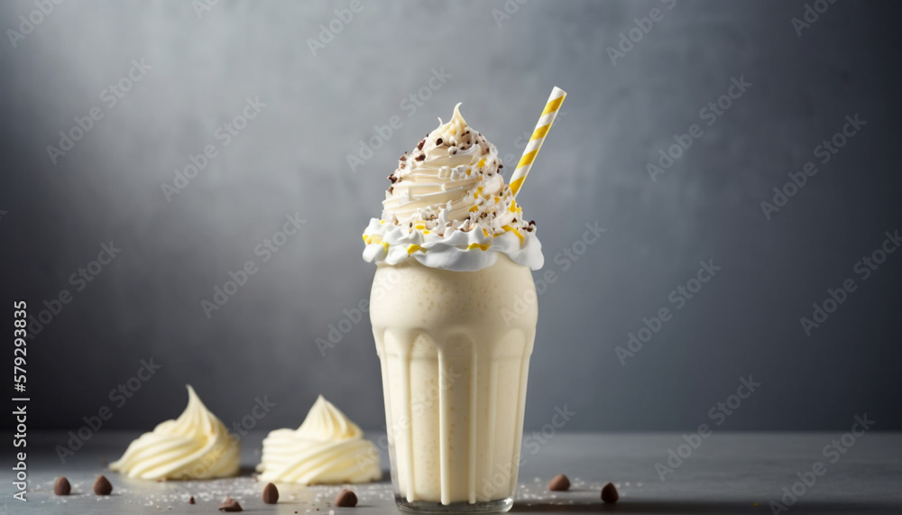
Smooth, cold, and clean. The classic that keeps the whole menu grounded.
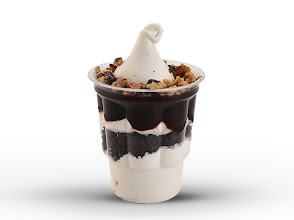
Shayked is a compact dessert-and-shake storefront built around three quick hits: Vanilla Shake, Oreo Shake, and Brownie Sundae. Clean look, bold flavor, zero clutter.
The homepage now reflects the actual offering instead of a fashion template. These featured cards map directly to products already added in the catalog.
The interface now leans into your requested black, white, and blue language, with the reference mark used as a hero asset and a simpler menu-first layout underneath it.
Deep blue anchors the identity, black keeps the edges crisp, and white gives the content room to breathe.
The homepage now leads with actual products and price clarity instead of unrelated category or fashion language.
The product cards pull from the database, so future shakes or desserts can slot into the same flow cleanly.
The storefront is now pointed at Shayked, the signature products are in the catalog, and the homepage is aligned with the brand direction you shared. We can keep extending the menu from here.